
Social distancing increased digital banking adoption, and many fintech solutions had to be quickly reinvented and adapted to a new context. The world economy is moving towards virtual currency and the number of payment services increases by the day. Moreover, investing in financial markets is now much more accessible, as we have witnessed in the past Gamestop stock ride.
Customer experience is undergoing a revolution. The fintech world is undoubtedly growing and competition is fierce, pushing companies — and us, as product designers — to continually improve our current products.
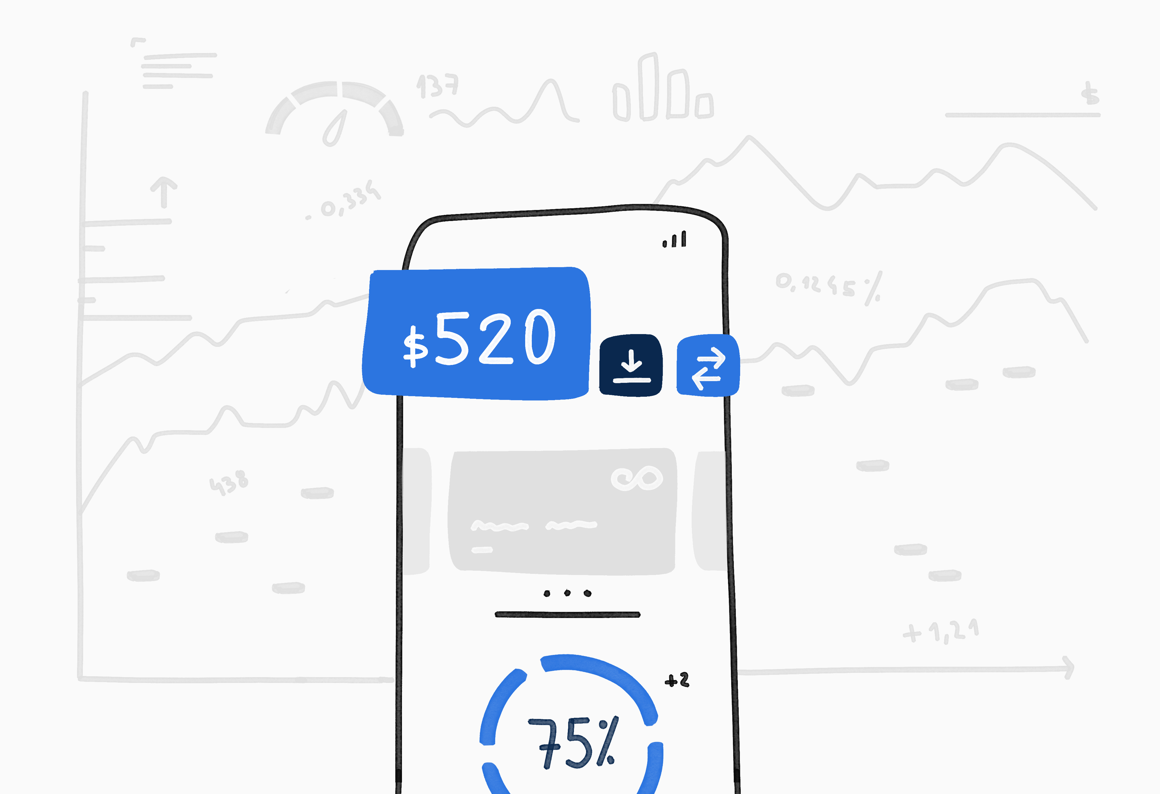
In this article, I would like to share my experience in designing fintech applications, go over five common misconceptions in the industry, and some ideas to avoid them.
You will realize this if you know your users in depth. At Wolox, our UX research team is devoted to exploring and defining the various emotions and needs of clients. Based on these insights, we define not only an appropriate tone but also how much information the user needs to successfully perform each task.
In my experience, some financial products require two different onboardings designs. For example, the process for an individual account may be different from a corporate one likewise for an investor and a new fintech user. Or, we could also need different onboarding processes depending on the nationality.
Trust your UX research team to shed some light on these possibilities and don’t always stick to a “one size fits all” mindset.
Managing personal finances triggers an array of emotions. A lot of personal data may be requested in the onboarding process, and nowadays users are increasingly aware of the importance of privacy. If they don’t understand why some data is requested, they may feel suspicious, ultimately causing user drop-offs in the onboarding stage.
During the process, we should offer context about why this data is needed, and also we could guide the user on where to get it. Input helpers — small helping messages — are a good ally to make the user feel safe and confident.

Also, try to focus on positive emotions. Simple actions such as receiving, sending money, or setting an automated bill payment are good moments of joy that the app can celebrate conveying an appropriate message to the user.
And don’t forget that maybe your users are not experts in Finance. So, please, get rid of those jargon words and “translate” them into everyday language to ensure clarity.
Users will have to provide an ID number, date of birth, address, etc. Make sure you only ask for the minimum amount of data requirements. Those that are not necessary for the onboarding process can be asked later on.
A good starting point could be to break down the onboarding process into steps focusing on one task at a time: personal information, financial status, etc. It will surely make the process much smoother and simpler.
We can also leverage technology to make the data verification process easier. For example, our user could scan an identity document to move forward faster. In that case, bear in mind to help them solve common issues with messages like this:

Accessibility lays a solid foundation for inclusion and is one of the most important values in products today. An accessible product is a product that will reach more people, will ensure higher levels of user engagement and, ultimately, greater benefits for companies.
Keep always in mind the Accessibility Guidelines for Web Content developed by the W3C (World Wide Web Consortium) and its best practices:
Fintech apps may contain a large number of functionalities, operations, and customization options but, in general, the average user only focuses on a few. So, here is a piece of advice that you may have already heard of: less is more.

It is crucial that main functionalities and secondary had already been distinguished so that the former have easier access. In this way, the user will be able to perform frequent tasks faster.
On top of that, the visual language should not break patterns that the users are already used to. For example, standard icon shapes allow them to easily recognize its meaning and curb user mistakes.
Likewise, thoughtful use of white space (negative space) will prevent your interface from looking cluttered. In this way, you will help the user to scan the layout and easily find zones of information and elements of interaction.
You are not a designer, you are a user advocate! Keep in mind your different user profiles, try to empathize with their emotions when interacting with the app, consider the value of their time and create an accessible and clear interface to avoid common pitfalls and ensure an impeccable product.
Creating a remarkable user experience can help people make informed and accountable financial decisions. Let’s change people’s lives one app at a time! 😉
 Novedades
 Eventos
 Publicaciones
 Talento
 Podcast